![]() Australian Youth Orchestra
Australian Youth Orchestra
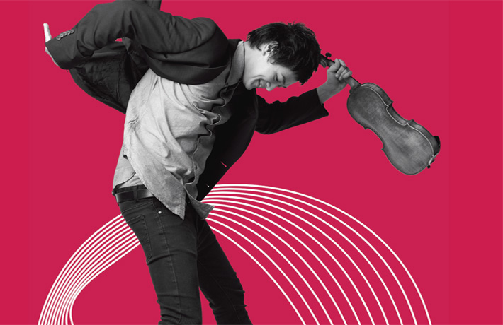
From Raw Talent to Perfect Harmony
You may have noticed, we have a new logo. With exciting new artist collaborations and global tours in the works, and as a result the need for extra funding support, 2012 was the perfect time to refresh our look. We wanted the new AYO identity to inspire and represent the talents of Australia’s best young classical musicians, from emerging, gifted, school-aged students to those on the verge of a professional career.
Inspired by the lines and spaces of musical staves, and to reflect the AYO’s positioning of “raw talent to perfect harmony,” design company Landor constructed two forms for each of the three letters in the identity. The inner letter, which moves and changes, is informal and quirky and represents raw talent. The outer, which remains consistent, is balanced and structured to stand for perfect harmony.
We hope you like it as much as we do!
Our thanks to the team at Landor for their pro-bono support of the AYO including Mike Staniford, Executive Creative Director, Nichola Dearn, Creative Director, Matt Morgan, Senior Designer and Marivel Izon, Account Manager.